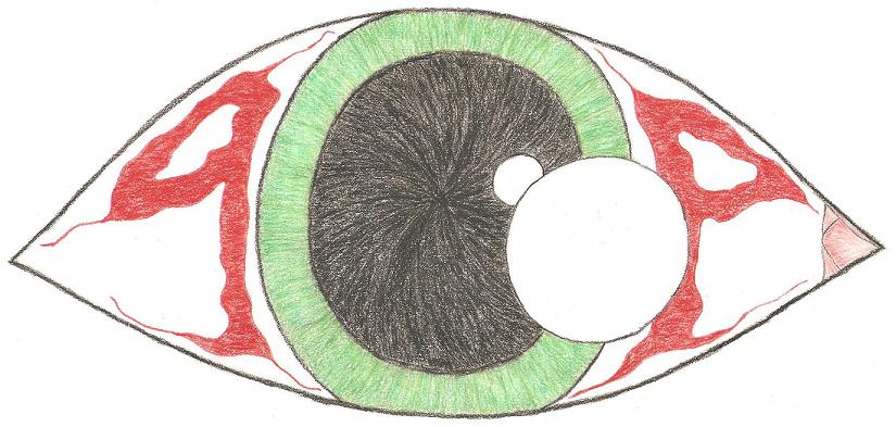
Ok so the eye that is pictured at the top of the forum is designed of an idea that the founding fathers of pCp came up with back in the day. Now, this particular picture is something I drew up recently to illustrate the pCp logo/design/mark of honor.... However; my artistic abilities aren't the best. Anyone who would like to contribute a picture or computer rendering feel free to post here or contact me with your idea.
The bare basics of the pCp logo are: It's a blood-shot eye, the 'P's are part blood-shot, the 'C' is the iris.
I went with the first 'P' being backwards as I prefer it that way but it is open to personal creativity. Also I went with a green eye as I think green or blue would stand out a bit better. The white circles in the center are suppose to be light reflecting of the eye and that is what distinguishes the 'C'
Alright have fun with your creativity or steal someone else's.